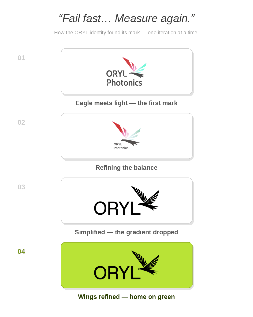
An eagle, a stubborn shade of green, and more iterations than I would like to admit.
Not many people know that ORYL began with the mantra: “Fail fast… Measure again.” Like most things worth doing in life, you iterate until it feels right, and our visual identity was no exception. Now that we have arrived somewhere we are
proud of, it is fun to look back — this is a story of how our visual identity evolved.
The first mark: an eagle and a light, the wings are the science
ORYL carries duality of meaning — Eagle (Orel in Slavic) and My Light (in Hebrew) — symbols of clarity and vision. The first logo combines both ideas as one – the eagle wings depict – red light rays the striking a surface and coming out as green light ray. This representation depicts second harmonic scattering, where infrared light turns into green light – a representation of how we started ultrafast light scattering. The Eagle, I like to say is at the heart of our technology: ultrafast light scattering. That is not a decorative flourish; it is the physics the instrument is built on, and it is also, conveniently, where our colour came from. The identity and the science point at the same thing.
The font was an attempt to borrow the feel of the EPFL logo of the time. It was David (Roesel) who invented the logo, and worth mentioning, how ORYL started.
Why green, and why it was so hard
When we simplified the eagle, we committed to green as the primary colour. Part of that is conviction: sustainability is a real driver for us. The rest is simpler: I like green, and it has a refreshing effect that felt right for a young company. What we did not expect was how hard the right green would be to find – though it was mostly Kaspar (Cottier) who spent the time finding the right shade. Too far one way and it turns muddy; too far another and it reads militaristic; push for energy and it starts screaming off the screen. There were a great many iterations in between the ones you would actually want to see.
What the iterating taught me
The reward, it turns out, is not in arriving. It is in doing the thing again and again until it finally feels right, and that is the reason I love entrepreneurship, and building things in general. As the old saying goes, every drop of water becomes precious when you carry it from the well. Failing fast, ironically, has been the fastest and most enjoyable path we have found to something we are happy with. A brand, like an instrument, is never quite finished; I expect we will keep refining this one too.
Now it comes alive
The fully rebranded ORYL is now live on our new website, where the eagle, the green, and the rest of it finally sit together in one place. I am incredibly proud to share it with you.
— Orly Tarun, Founder & CEO, ORYL Photonics